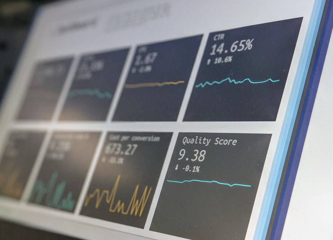
If you need an executive-friendly “dashboard” in Notion without upgrading to the Business plan, build a single page of charts powered by a few related databases (Projects → Tasks → Deals). Each chart is created from a database view, filtered to the KPI you want (like “In progress tasks” or “Open deals”), then laid out in columns so leadership can scan status in under a minute.
Photo by Stephen Dawson on Unsplash
What “executive dashboard” means in Notion (and what your plan changes)
Notion now has two ways to do dashboard-style reporting:
Dashboard view (widget-based + global filters): great for multi-widget filtering, but availability can vary by plan and workspace setup.
Charts on a page (works great for exec reporting): add one chart at a time from a database and arrange them into a clean layout.
The chart-on-a-page approach is the simplest path for ops and marketing leaders because it:
Keeps the data model clean (databases stay the “source of truth”)
Makes reporting repeatable (charts update when the database updates)
Avoids over-optimizing your workspace plan before you prove value
The data model: 3 databases that make executive reporting easy
For most teams, an executive reporting page is easiest when your data is split into three related databases:
Key properties: Status, Assignee, Due date, Project (relation)
Deals (CRM pipeline snapshots, or imported CRM exports)
Key properties: Stage, Amount, Close date, Source, Owner
How to relate Projects and Tasks (so reporting works)
In Tasks, add a relation property: Project → points to Projects.
In Projects, add a rollup:
Roll up Task Status (or roll up “Completed” checkbox) to calculate progress.
This is what enables charts like:
“% of projects on track”
“Tasks due this week”
“Projects with overdue tasks”
Step-by-step: build a KPI page using charts (+ columns)
Step 1: Create an “Executive Dashboard” page
Create a new page called something like Executive Dashboard and keep it simple:
Top row: 3–5 KPI number charts (quick scan)
Middle: 1–2 trend charts or grouped bars (progress over time or by owner)
Bottom: linked views for “Needs attention” lists
Step 2: Add your first chart from a database
On the dashboard page:
Type /chart
Pick a chart type (start with Number or Donut)
Select the database (Tasks, Projects, or Deals)
Configure:
What to show (count, sum, group by status, etc.)
Filters (only “In progress”, only “This quarter”, only “Marketing team”)
Example: KPI — “In progress tasks”
Database: Tasks
Chart type: Number
Filter: Status = In progress
Display: Count of tasks
Step 3: Use columns to create a “dashboard” layout
Once you have one chart:
Add a column layout (drag a block to the right until you see the blue column guide)
Put 2–3 KPI charts side-by-side
Keep widget titles short (execs skim)
Tip: Each chart needs its own filter rules, so reuse your saved database views when possible to avoid reconfiguring filters repeatedly.
How to handle CRM reporting without a full HubSpot sync
Many teams try to start with an automatic sync from HubSpot—but executive reporting doesn’t require that on day one.
Fastest win: export → import → chart
For a board meeting or quarterly report:
Export a CSV from HubSpot (deals, MQLs, pipeline stages)
Import that CSV into Notion as a new database (or merge into an existing Deals database)
Build charts on top of that imported database
This gives you:
A clean reporting snapshot
Shareable links for leadership
An easy “proof of value” before you invest in a sync tool
A practical “executive dashboard” template (KPIs to start with)
Here’s a starter KPI set that works well for ops + marketing leadership:
Tasks completed this week (Tasks → filter Completed + date range)
Tasks overdue (Tasks → filter Due < today AND Status ≠ Done)
Active projects (Projects → filter Status = In progress)
Pipeline value (Deals → sum Amount where Stage ∈ open stages)
New leads/MQLs this month (Leads DB or imported CSV)
Common mistakes (and how to avoid them)
Trying to dashboard everything at once: start with 5 KPIs and one “Needs attention” list.
Using one mega-database for everything: separating Projects, Tasks, and Deals makes charts and ownership clearer.
Overcomplicating permissions early: get a working exec page first, then tighten access.
Get help building this
Building an executive dashboard in Notion — the data model, chart layout, and KPI filters — takes most teams a few days of evenings to get right. If you'd rather skip the trial-and-error, book a ZoomFlow session. One of our consultants will build it with you in real time on a single call — and you'll own the working dashboard when we're done.
Learn how to use Claude to design a practical scheduling assistant for a service business: data model, daily updates, dispatch workflow, and rollout steps.
Plan a Confluence to Notion migration without breaking permissions or governance. Use this enterprise checklist for discovery, pilots, rollout, and cleanup.